4.9/5
4.9/5


Stand close to a real Van Gogh and the first thing you notice usually isn't the subject. It's the paint. Ridges of it, dabs of it, strokes laid down so fast you can follow the turn of his wrist. So what is so special about Van Gogh's paintings? Mostly this: he let color and brushwork carry the feeling, and he did it with subjects anyone could have walked past, like a bedroom, a café or a vase of flowers going to seed.
That's why his pictures reach people who know nothing about art history, and why the Van Gogh paintings that still get copied most are the thick, loud, yellow and blue ones. What follows are seven things to look for the next time you're standing in front of one. If you're after the emotional side, the question of why people fall so hard for him, there's a separate piece on why we love his work. This one stays on the canvas.
1. Paint you can see from the side
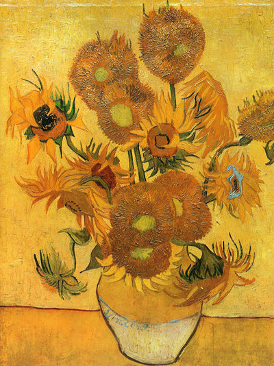
Van Gogh used oil paint like a building material. In the vase of fifteen sunflowers he painted in August 1888, long strokes run along the petals, leaves and stems, while the seed heads are made of small raised dabs, stippled on so they bristle the way real seed heads do. He was taking advantage of the stiffer oil paints that arrived in the nineteenth century, which could hold a ridge instead of settling flat.

Painters call that thickness impasto. It changes how a picture behaves in a room: light catches the edges of every stroke, and if you step a little to the left the surface shifts with you. A photograph flattens all of it, which is why people who know Van Gogh only from posters are often startled by the real thing.
He worked fast, too. He painted the first four sunflower canvases in a single week, racing the flowers before they wilted, and you can read how the London canvas was built up stroke by stroke. Speed is part of the look. Nothing is blended to death.
2. Color that isn't true to life
In September 1888 he painted an all-night café in Arles and told Theo he had tried to express "the terrible human passions with the red and the green." The room is blood red and dull yellow, a green billiard table sits in the middle, and four lemon yellow lamps glow orange and green. No café in Arles looked like that. In the same letter to his brother he admits the color isn't locally true from a realist's point of view. It's there to suggest an emotion, an ardent temperament.
That was his real break with the Impressionists he'd met in Paris. They were chasing what light did to a haystack at a certain hour. He wanted the color to carry the mood, even if the haystack came out the wrong shade. Once you've seen this, you'll spot it all over his work: orange faces, blue shadows, skies that are green near the horizon.
(He thought the café picture was one of the ugliest he'd done, by the way, and put it in the same family as The Potato Eaters. He wasn't always his own best judge.)
3. Opposite colors pushed together
Look at the self-portrait he made behind his easel in his last Paris winter, December 1887–February 1888. His smock is blue, his beard orange-red, and the palette in his hand holds exactly the pairs he used on the canvas: red and green, yellow and purple, blue and orange. Those are complementary colors, opposite each other on the color wheel, and when you set them side by side each one makes the other louder. He laid them down almost unblended.
This is the quiet trick behind the glow. A blue night pressed up against a yellow awning hums in a way a carefully graded sky never will, and the café terrace under a starry sky is built almost entirely on that one pairing. Squint at any of his Arles pictures and you'll find the opposites sitting shoulder to shoulder.
4. A whole picture made of yellow
The sunflowers are also an experiment. He painted large canvases of sunflowers in a vase using shades of yellow and very little else, to prove a picture could run on variations of one color without losing any of its force. In all there are seven versions from 1888–1889: four painted in August 1888 and three repetitions in January 1889, which he regarded as equal copies of the originals. One of the repeats is the version the family kept in Amsterdam.
Yellow was personal for him. He made the series to decorate the Yellow House before Paul Gauguin moved in, and hung two of them in the guest room. Gauguin arrived on 23 October 1888 and thought the sunflowers were completely Vincent. The two canvases Van Gogh rated highest he signed just "Vincent," because people struggled with his last name. Soon after his death he was known simply as the painter of sunflowers, and that label has never really come off.
5. Flat shapes borrowed from Japanese prints

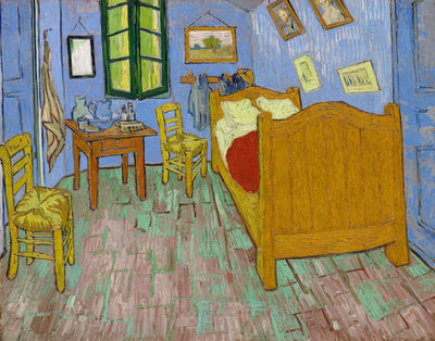
In October 1888 he painted his bedroom in the Yellow House and mailed Theo a sketch with a color list: pale violet walls, red tiles, butter yellow bed and chairs, a scarlet blanket, lilac doors. Then came the key line: "The shadows and cast shadows are removed; it's coloured in flat, plain tints like Japanese prints." You can read the full description with his little croquis and compare it with the painting.
Two things surprise people. The walls and doors look blue today because the pigments have faded; they were purple. And the odd angle of the back wall isn't a mistake. That corner of the room really was skewed. The wobbly perspective elsewhere was deliberate, a flattening meant to look like a print.
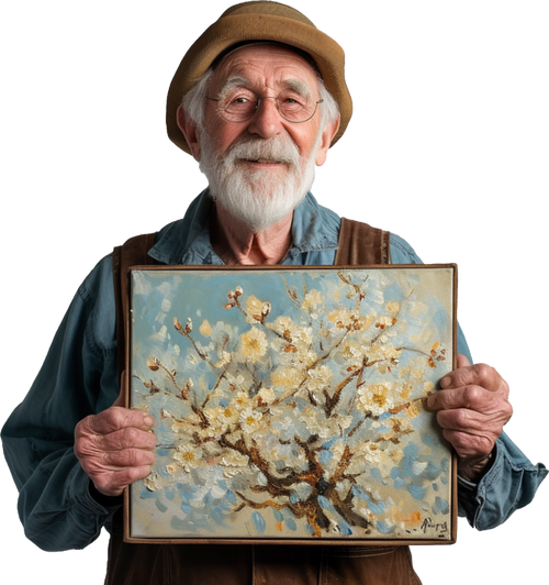
The same borrowing drives the almond branches he painted for his newborn nephew in February 1890: bold outlines, a branch cut off by the frame, flat blue behind it, all lifted from Japanese printmaking. It was a gift for Theo and Jo after their son, Vincent Willem, was born. That boy grew up to found the Van Gogh Museum.
6. Plain subjects, taken seriously
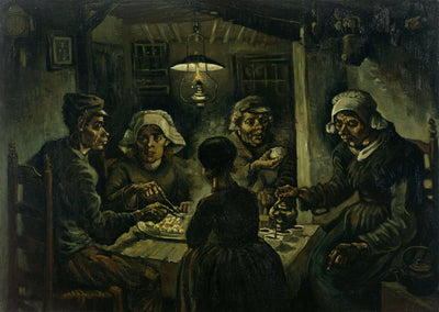
Van Gogh almost never painted anything grand. His first big statement, made in Nuenen in April–May 1885, was five peasants around a table eating potatoes. He gave them coarse faces and bony hands on purpose, because he wanted to show they had tilled the earth with the same hands they were putting in the dish and had honestly earned their food. He painted them in earth colors, and wanted the tone of a dusty potato, unpeeled.
That dark supper scene looks nothing like the later Arles work, but the attitude is the same. A bedroom, a pair of boots, a chair, a postman, a field of wheat: he gave ordinary things the attention other painters saved for kings. That's a large part of why his work feels close. You've sat in a room like that. You've eaten a meal like that. You can read what he meant by it in the peasant supper he called a showpiece, which is now one of his most famous works.
7. A real view, pushed until it moves
At the end of May or early June 1889, living at Saint-Rémy, he wrote that he'd looked at the countryside from his window long before sunrise, with nothing but the morning star, which looked very big. A couple of weeks later, around 18 June, he mentions almost in passing that he has a new study of a starry sky. That study is the swirling night over Saint-Rémy.

Everything in it started from something he could see: the hills, the village, the cypress, the morning star. Then he let it go. The sky coils, the cypress flickers up like a flame, the stars swell into wheels. By September he counted the night picture among a few canvases he considered exaggerations in their arrangement, with lines contorted like old woodcuts. He wasn't sure he'd pulled it off. The rest of us disagree, and this is probably the clearest example of all seven traits working at once.
Why did no one like Van Gogh's paintings at first?
Some people did, but most of his contemporaries saw the same things we admire and read them as faults. The Potato Eaters drew real criticism in its day because the colors were so dark and the figures were full of mistakes. The later work went the other way: colors no one had seen in nature, outlines as wide as a finger. He knew what was coming and expected people to tell him mountains weren't like that.
His career was also short. He was born in 1853 and died in 1890, and almost everything on this list happened in the last five years. There wasn't much time for taste to catch up. The best way to see how clearly he understood what he was doing is in his own words, and the letters worth starting with are a good place to begin.
Who was better, Da Vinci or Van Gogh?
It's a fun question with no real answer, because they wanted opposite things. Leonardo built a face from soft transitions you can't find the edge of, and hid his hand. Van Gogh drew a black line around the edge and wanted you to see every stroke. If you judge painting by how convincingly it imitates the world, Leonardo wins. If you judge it by how much feeling a painter gets onto a canvas with color alone, it's hard to beat Van Gogh. Put them next to the paintings people ask for by name and you'll find both at the top.
Living with one of them
Almost everything above is about surface: ridges of paint, colors pushed together, strokes you can follow. That's exactly what a print loses. A hand-painted copy in oil keeps the texture, so the sunflowers still bristle and the sky still turns when the light moves across it. If you'd like to see how that works in practice, browse every Van Gogh our studio paints by hand.