4.9/5
4.9/5


Put ten unlabeled paintings from the 1880s on a wall and most people can pick out the Van Gogh in a couple of seconds. That's unusual. Plenty of his contemporaries painted the same cafés and wheat fields. What gives him away is a handful of habits he repeated until they became a signature, and once you can name them, the Van Gogh art style stops being a vague feeling of "swirly and yellow" and turns into something you can actually see.
Below are seven of those habits, each tied to one painting where it shows most clearly. If you want to test them against a wider run of his canvases, the traits hold up across almost everything he made after 1886.
What defines Van Gogh's art style, in one paragraph
Van Gogh painted with visible, directional brushstrokes and thick paint, chose colors for their emotional charge rather than their accuracy, and borrowed bold outlines and flat areas of color from Japanese woodcuts. His subjects were ordinary: peasants, chairs, a bedroom, trees. He treated them with the intensity other painters saved for history or myth.
He didn't start that way. His Dutch work was dark, earthy and heavy. The change came in Paris between 1886 and 1888, where his brother Theo introduced him to the colorful work of modern painters like Claude Monet and where he met Henri de Toulouse-Lautrec and Emile Bernard at Fernand Cormon's studio. His palette brightened, his strokes got shorter, and he and Theo started collecting Japanese prints. The switch from dark to light is the hinge of his whole career. On 20 February 1888 he arrived in Arles, and nearly every trait below reached full strength in the two and a half years he had left.
1. Brushstrokes you can follow with your finger: The Starry Night

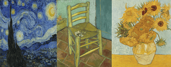
Van Gogh made every stroke count as a mark in its own right, and he laid them down in directions that describe movement. In the 1889 sky that spirals over a sleeping village, the strokes don't fill in the sky so much as churn it. Wind and starlight turn into currents.
He painted it at Saint-Rémy, where he was a patient at the asylum. In early June 1889 he wrote to Theo about watching the countryside from his window long before sunrise, when the only thing in the sky was a huge morning star (you can read the full letter from the asylum). Around 18 June he reported a new study of a starry sky. The view is real. The motion is his.
Look at any late Van Gogh with this in mind and you'll see it everywhere: grass combed in one direction, walls hatched in another, a sky that curls around a sun.
2. Paint laid on like frosting: Sunflowers
Van Gogh used a lot of paint. The stiff new oil paints of the 19th century let him build ridges and knots on the surface, a technique called impasto, and he leaned on it hard. In the yellow still life that hung in Gauguin's room, long strokes follow the shape of each petal while small raised dabs mimic the bristly seed heads. In a raking light the canvas is almost sculpture.
The picture is also close to a single color. It runs from deep orange ochre to a pale, greenish yellow, and that restraint is part of why it hits so hard. He made it in Arles in 1888 to decorate the Yellow House before Paul Gauguin came to stay. There are seven sunflower canvases in all: four from August 1888 and three repetitions from January 1889. The London version measures 92.1 × 73 cm, big enough that the texture reads from across a room.
3. Color chosen for feeling: Café Terrace at Night
This is the trait that separates him most clearly from the Impressionists he learned from. They set out to record how light looked. He used color to carry emotion, and he pushed opposites against each other (red against green, yellow against blue and violet) to make them buzz.
In September 1888 he set up his easel after dark on the Place du Forum in Arles and painted the gaslit terrace under a starry sky on the spot. Writing to his sister Wil, he called it "a painting of night without black," made with "nothing but beautiful blue, violet and green," with the lit square in pale sulphur and lemon green. He'd noticed that gaslight, being yellow and orange, makes the surrounding blue look deeper. The canvas, 80.7 × 65.3 cm, is now at the museum at Otterlo in the Netherlands.
Earlier that month, in the same letter to Wil, he described the opposite mood: a café interior painted red, with a green billiard table and six or seven different reds, from blood red to soft pink, set against as many greens. Same town, same month, and the color tells you which place feels safe.
4. Outlines and flat color from Japanese prints: Almond Blossom

Japanese woodcuts sold in huge numbers in Paris. He took their bold outlines and their odd cropping, and the strong color contrasts came along with them. You can see both in the branches against a blue sky he painted in February 1890. There's no ground and no horizon, just the tree cut off by the frame and pressed flat against the blue. Almond trees flower early, so the subject stood for new life, and he painted it for Theo and Jo after the birth of their son, Vincent Willem. The family kept it, and that boy grew up to found the Van Gogh Museum.
The same idea runs through his bedroom in the Yellow House, painted in October 1888. In a letter to Theo he explained that he had left out the shadows and used flat, plain color, the way a Japanese print does. The colors were meant to express complete rest, or sleep. The walls, which look blue today, were originally purple; the pigments have discolored. And the odd angle of the back wall isn't bad drawing. The corner of that room really was skewed, and he flattened the rest of the perspective on purpose.
5. Ordinary people, painted without flattery: The Potato Eaters
Before the bright colors, there was this. In April and May 1885, in the Dutch village of Nuenen, he painted five peasants sharing a meal and meant it as his showpiece. He gave them coarse faces and bony hands on purpose, and chose earth tones that he compared to "the colour of a really dusty potato, unpeeled of course."
Critics didn't like it. The colors were too dark and the figures full of mistakes. But the conviction behind it never left him: working people and plain things were worth a serious painting, and getting the feeling right mattered more than getting the anatomy right. The palette changed in Paris. The loyalty to ordinary subjects didn't.
6. Objects that stand in for people: Van Gogh's Chair

In November 1888, with Gauguin living in the Yellow House, Van Gogh began two empty chairs as a pair. His own is a plain rush-seated chair in daylight, painted yellow on red tiles, with his pipe and tobacco pouch on the seat and a box of sprouting onions signed "Vincent" behind it. Gauguin's is a carved armchair shown at night, lit by a candle and a gas lamp, with two novels on the seat.
Neither has a sitter, and both are portraits. The simple chair tells you something about a man who valued plain things and nature; the armchair, in reds and greens, hints at Gauguin's taste for ideas and literature. Look closely at the yellow chair in London and you'll see blue edging around its legs, the outlined, flat-color method again. After their fight on 23 December 1888, Gauguin went back to Paris and the two never saw each other again, which makes the empty seats hard to look at.
7. Nature that seems to move: Wheat Field with Cypresses
By 1889 the directional brushwork had spread to everything. In his wheat field with cypresses, the version he finished in September 1889 in his room at Saint-Rémy after a first study painted outdoors in late June, the wheat ripples in the wind and the dark cypresses twist upward like flames. He was fixated on those trees and wrote that a cypress was "beautiful as regards lines and proportions like an Egyptian obelisk."
This is where the seven traits merge. Heavy paint, rhythmic strokes, strong color contrasts and a humble subject turned monumental, all in one canvas. It's also why a handful of his paintings land on every shortlist of the pictures almost everyone can name; you recognize them before you read the label.
Try it on the next Van Gogh you see
You don't need a guide to put this to work. Stand in front of any painting from his last years and run through four quick checks:
- Follow a single stroke. Does it point somewhere, around a petal or up a tree?
- Step sideways and look across the surface. Can you see ridges of paint catching the light?
- Find the strongest color pair. It's usually red with green, or yellow with blue and violet.
- Look for a contour line, often blue or red, running around an object.
If you get three yeses, you're almost certainly looking at something from 1888 or later. A dark, brown canvas with none of the above is probably from his Dutch years, and that's worth knowing too, because it shows how far he traveled in about four years.
Bringing his brushwork home
If one of these traits caught you, it's easier to see on a real canvas than on a screen, because impasto and directional brushwork are physical things. We paint Van Gogh's sunflowers, skies and fields by hand in oil, stroke by stroke, so the ridges of paint and the direction of each mark follow the way he laid them down.